
Florals? For winter?
A bouquet of inspiration via the brands that rule the *groundbreaking* garden.


Hi! This is a monster post that ends in a Wild West of floral clothing—good luck down there. I have always loved the Instagram account for Flowers in Cinema—not only does its curator have a great eye for screenshots, like this carousel from a movie I have written about more times than I can count, Věra Chytilová’ Daisies (1966):
But they are incredibly thorough, often introducing me to new films through the lens of their flower search—my GOAT Maggie Cheung stars in Center Stage (1991), a biopic of sorts on the first mega-star of Chinese silent film, Ruan Lingyu:
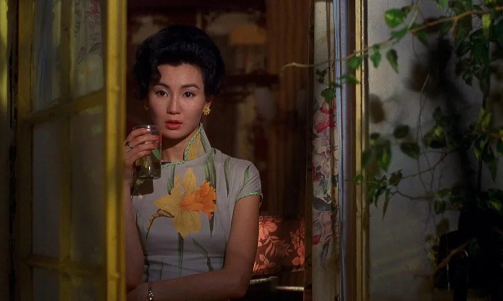
And of course, when thinking about flowers in conjunction with Maggie Cheung, I had to, once again, think about her zillion different floral cheongsams in In the Mood for Love. Two of my favorites are this one with greenish, squiggly piping on the edges and a huge, realistic daffodil:
And this black and white one featuring silhouettes of florals:
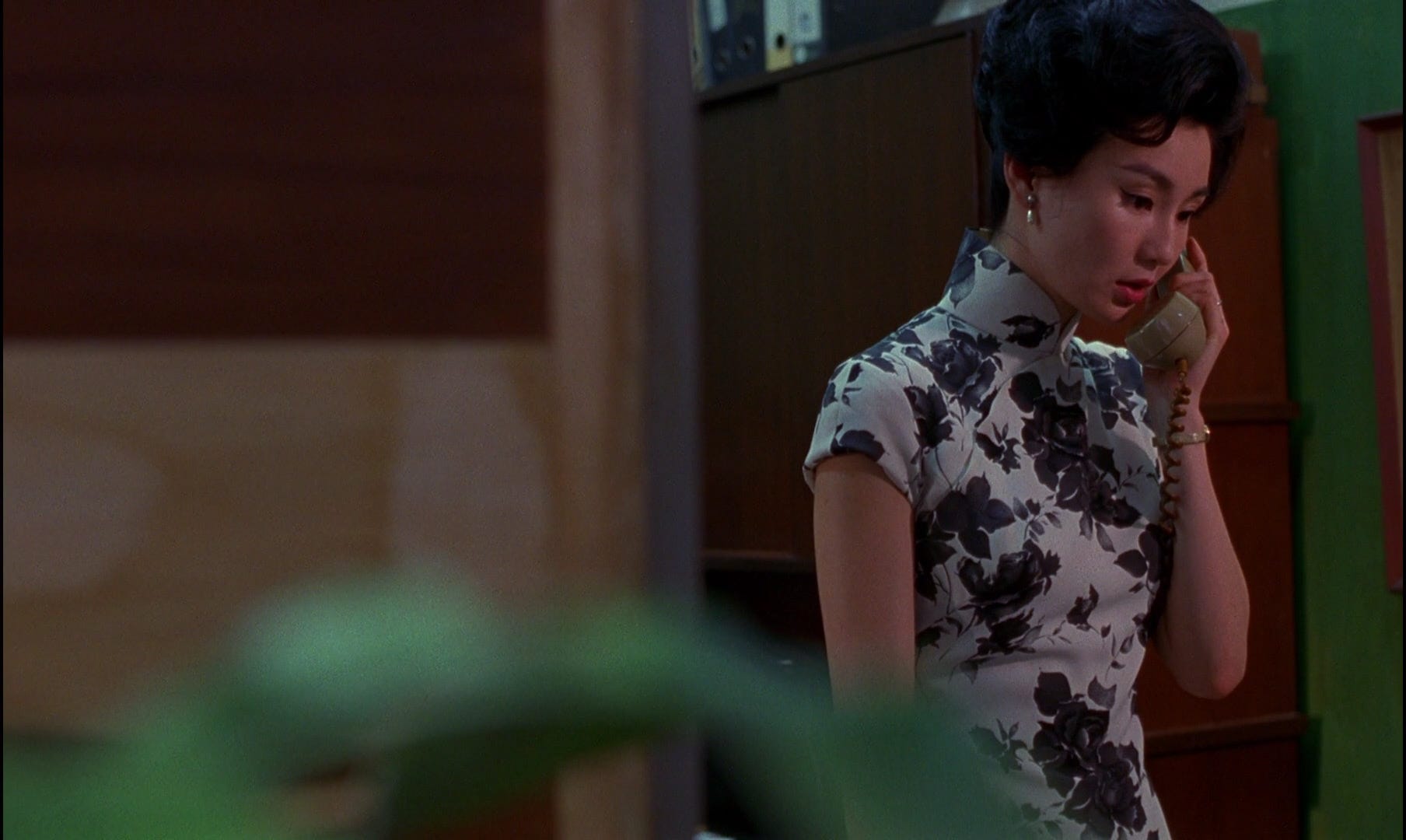
Though I believe ITMFL takes place during warmer months, seeing as the main characters are often out in the rain sharing longing glances and not, seemingly, freezing their pants off, to me, both of these prints evoke more fall/winter feelings for me—or maybe I’m just trying to cope with what feels, now that we’re in February, like the longest winter of my life thus far. Either way, after looking at all of the above florals, I fell into a deep, deep rabbit hole of winter florals that I hope you will join me in tumbling down today.
If you like these posts, please let me know by liking and commenting here or on Esque’s Instagram, subbing to the Esque Substack (this) for free, getting bonus posts for five bucks a month, or for ZERO DOLLARS, share (tag me if on IG so I can see and thank you)! If you share with three friends (or enemies), you’ll automatically get a free month’s subscription to Esque’s paywalled posts. If you buy anything from an Esque link, there’s a chance I’ll earn a percentage commission at no cost to you—if you end up inspired by anything below, please send over a photo of your new togs by replying to this email and I’ll comp you a month of Esque!
If you cannot afford the $5/month, I totally understand—respond to any of my email sends and I will get you a $2 subscription or comp you, whatever you need. Esque is for everyone!
THANK YOU for being here, and I am always available @that.esque on Instagram for sartorial scandals/situations/summons. Here is a little (big, actually, this time) preview of what’s below the paywall:
The things I noticed repeatedly below that make florals feel more compelling for a winter/cold-weather look are:
Photorealism
OR exaggeratedly unnatural neon cartoons
Combining them with:
Fur, plaid, leather
Printing them/embroidering them on satin
Patchwork
Black background
Black-and-white
Silhouette
3D knits
Emulation of porcelain
The two brands that, IMO, own “winter florals” (though there are several more below the fold), are Dries Van Noten, whose use of photorealistic blooms, sometimes cast in eerie shadows, takes on a raw, almost medicinal feel, grounding the flowers in the reality of winter, and Kenzo’s electric, kaleidoscopic babushka looks in the 80s and more subdued, tapestry-infused looks of later years. Both brands treat florals like things with attitudes of their own and not like emblems of Soft Beauty—they might overwhelm, or irritate, or poison, or cure.
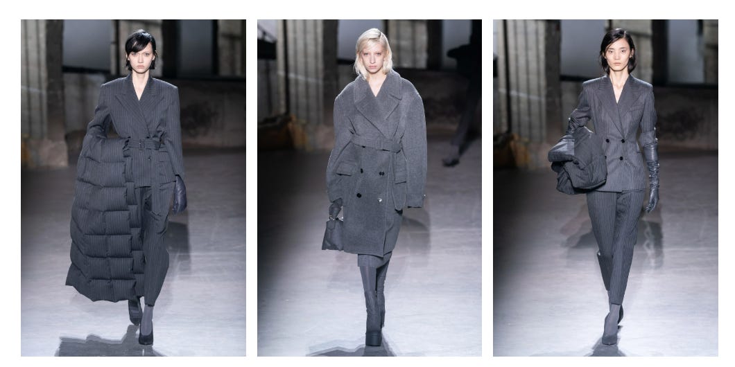
Dries Van Noten’s FW19 Ready-to-Wear show began with five looks hewn solely in charcoal pinstripe and wool, setting the stage for a solemn, near-brutalist autumn, but in the sixth look emerged a single flower casting a faux shadow against its gray background on the model’s chest:

From that point onward, the photorealistic flowers, many sporting their own shadow simulacra, emerged, becoming more and more frenetic in color combination as the show went on…

The “shadows” make the mock neck’s layers of opaque fabric with a gauzy skin look even more dimensional
Voluminous pinstripe pants feel prescient looking back with a 2025 perspective
Pretty much none of the looks feature a contrasting non-boot shoe—the same thing, whether color or pattern, is going on in the toes as in the shins, which I feel does a lot of heavy lifting in preventing these looks from feeling too busy or kitschy
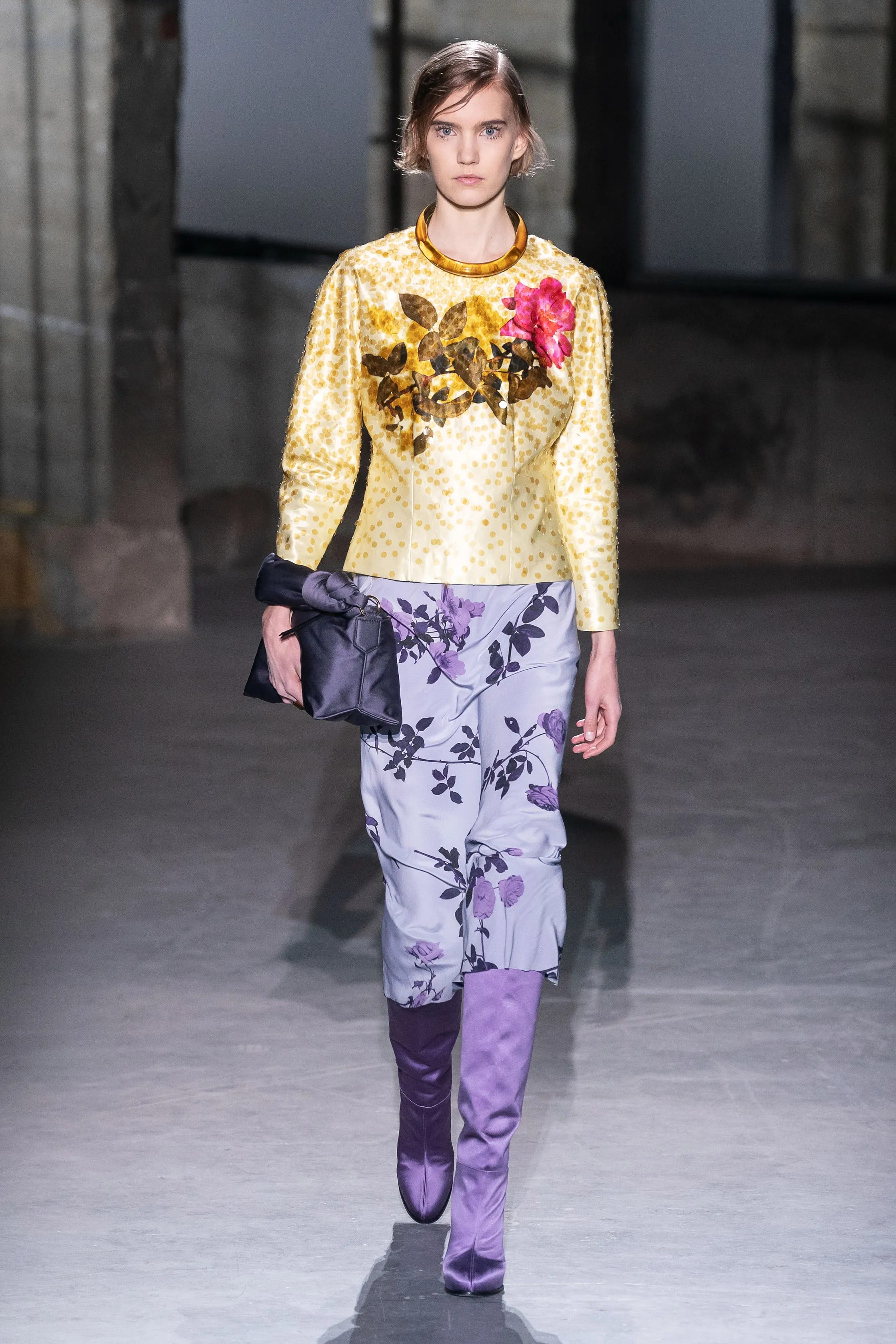
Necklace-as-collar is interesting—I can’t tell if I would like it better if the collar peeked out from inside the necklace or not, but I like the idea of a shirt with an attached metal collar—don’t think I’ve seen that commercially
Yellow and purple is a criminally underrated contrasting color combo—maybe having the largest swaths be pastel is the key to avoiding Lakers colors? or just using a bluer violet rather than a warmer purple?
Is this one of the first instances in the past ten years where we saw a straight, knee-length skirt paired with knee-high boots? History was made.
All of this greasy, matted hair and smudgy mascara (when will mascara make its triumphant return? perhaps in a year or two) feels very proto-Miu Miu
A detached collar with a T-shirt feels painfully 2017, but add some fur, and suddenly it’s shocking again
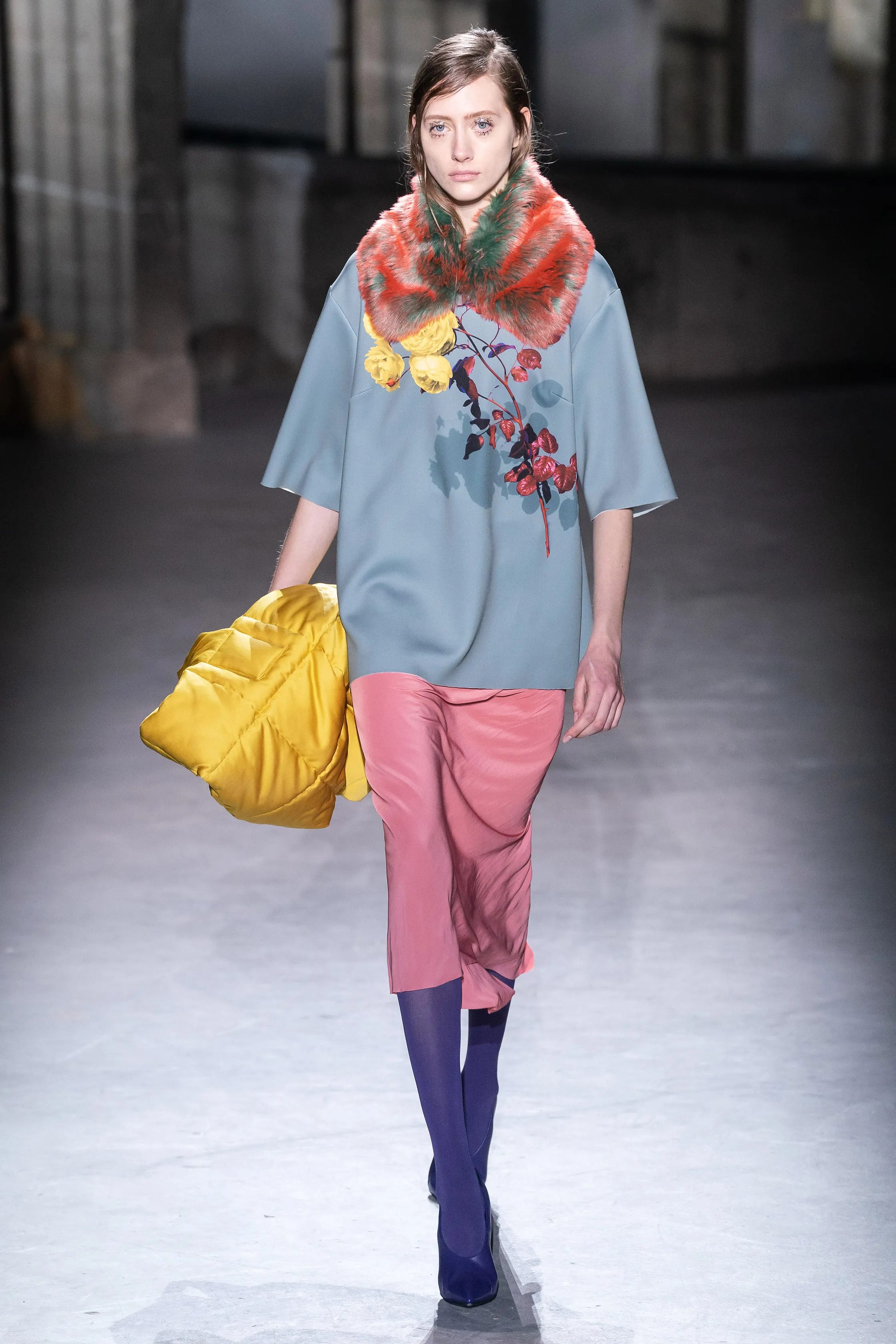
Red + green mixed together in fur and somehow not looking Christmassy is genius—the green almost looks like the red’s shadow. I guess when the colors mingle so intimately their complimentary nature starts to show its canceling-out effect
Raw edges of the sleeves make me want to grab some larger T-shirts and slice them at my elbows
That dusty teal is really underrated and I feel like we moved on from it too quickly
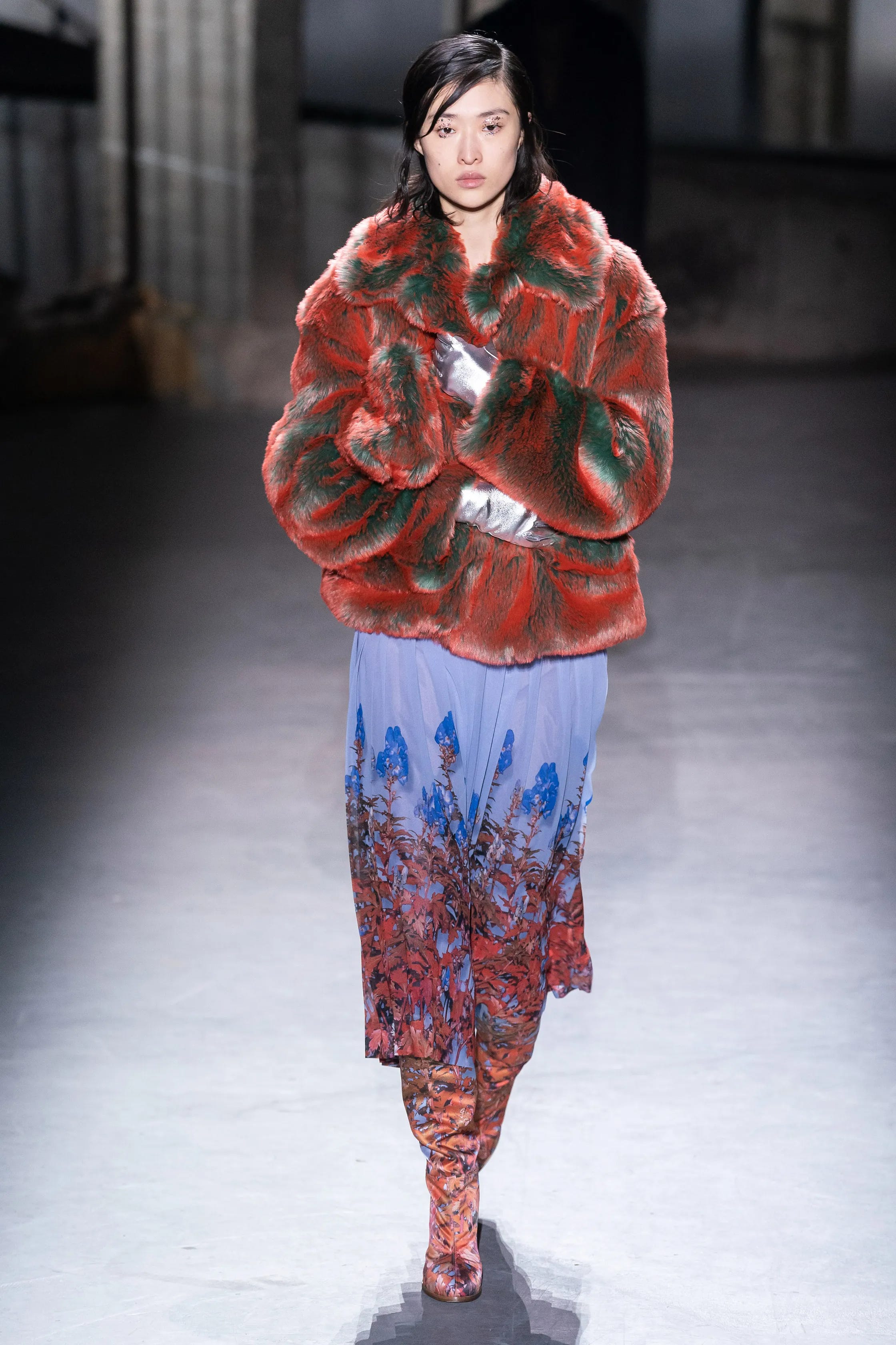
Ok it’s WILD that the red/green fur PLUS silver gloves isn’t skewing Xmas at all, and it’s all due to the cooling factor of the lilac and then the fact that the red flowers at the hem transition into nearly-orange flowers in the boots, mellowing the red out
Zero headgear really keeps things from getting too “festive”

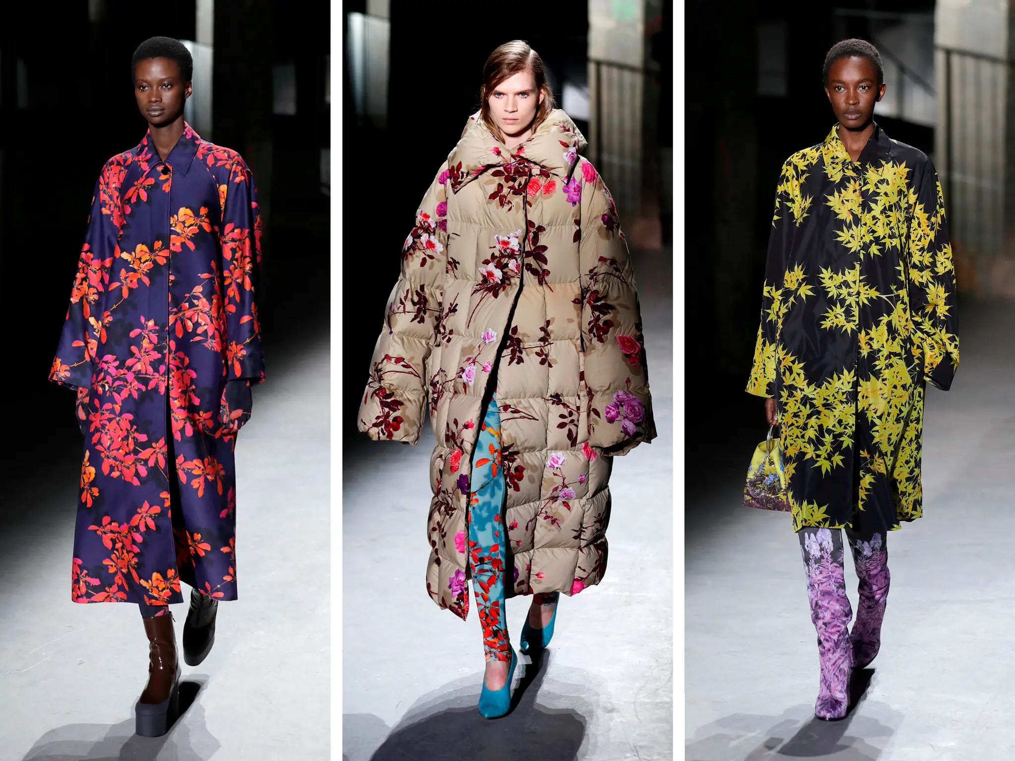
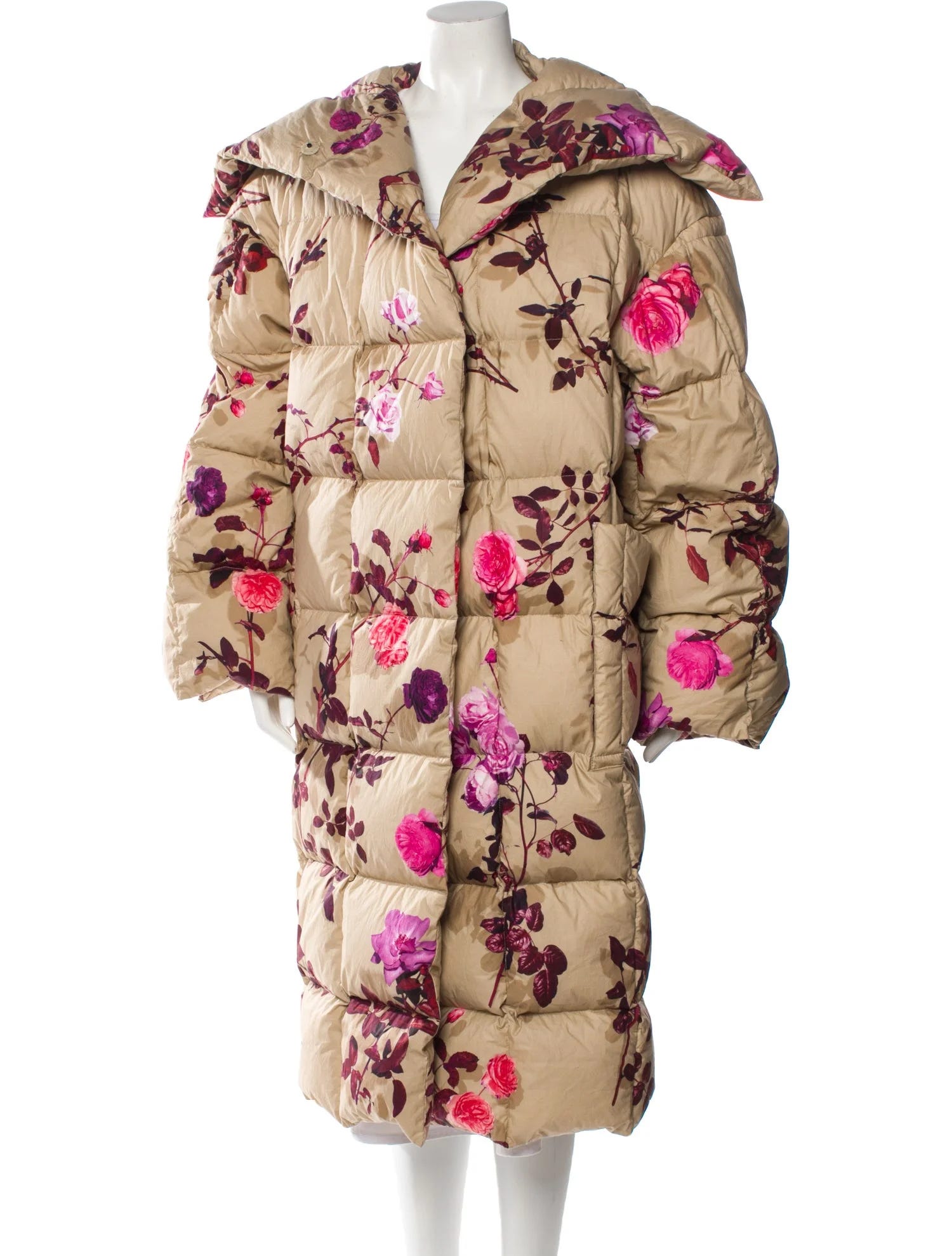
Sleeping bag coat’s bulk becomes almost balloon-light paired with the diaphanous tulle layer of the dress and the watercolor-y florals
Those boots were styled perfectly with the dress—they’re very 70s, but they look completely contemporary in this context, faded enough to juuuust clash without it feeling try-hard
…until at its climax, trenches and shin-length puffers boasted near-neon shades of fuchsia, yellow, and lilac, paired only with either boots or leggings and a notable lack of headgear.
The florals are ostensibly photos from Van Noten’s own garden digitally printed onto the garments. Inspired by Gertrude Stein’s writing, Van Noten wanted the flowers to read more human than romantic: “I liked the idea that a rose can be a person, it can stand for a symbol of beauty, it can stand for many things,” he said. This is what I’m trying to get at re: florals for winter—they feel very pragmatic, like medicinal plants for our minds. When flowers proliferate in spring, we can fixate more on the idea of them, on cartoonish representations and abstract deconstructions, but when we *need* to see them in the dead of winter, there’s something a lot more mater-of-fact about photorealistic florals.
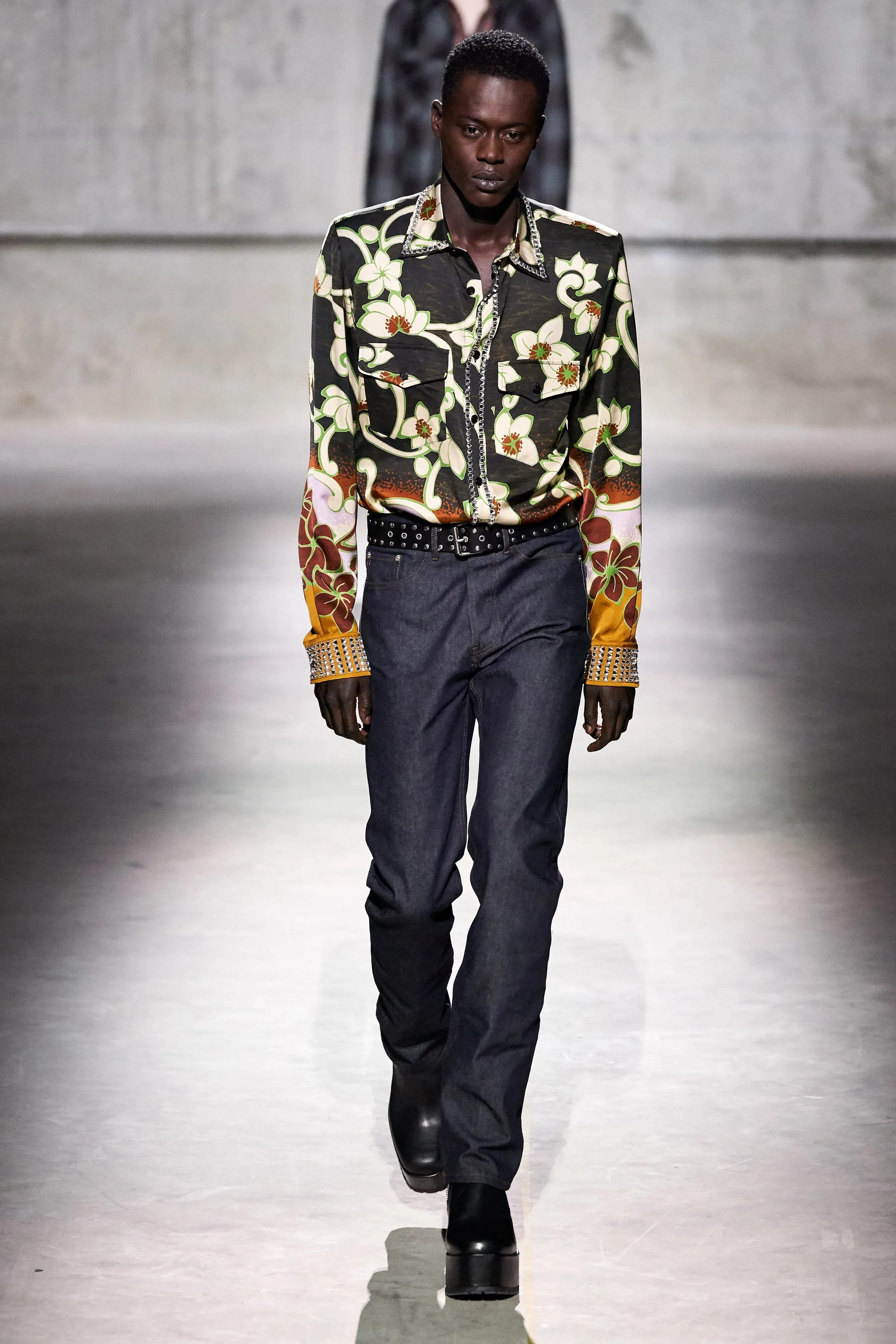
DVN’s floral menswear like the above for FW20 isn’t as compelling to me as the prior looks, because its cartoonish florals (and superfluous rhinestones) feel essentially like an alteration of a shirt made for summer months (though I like the rusty gradient)…
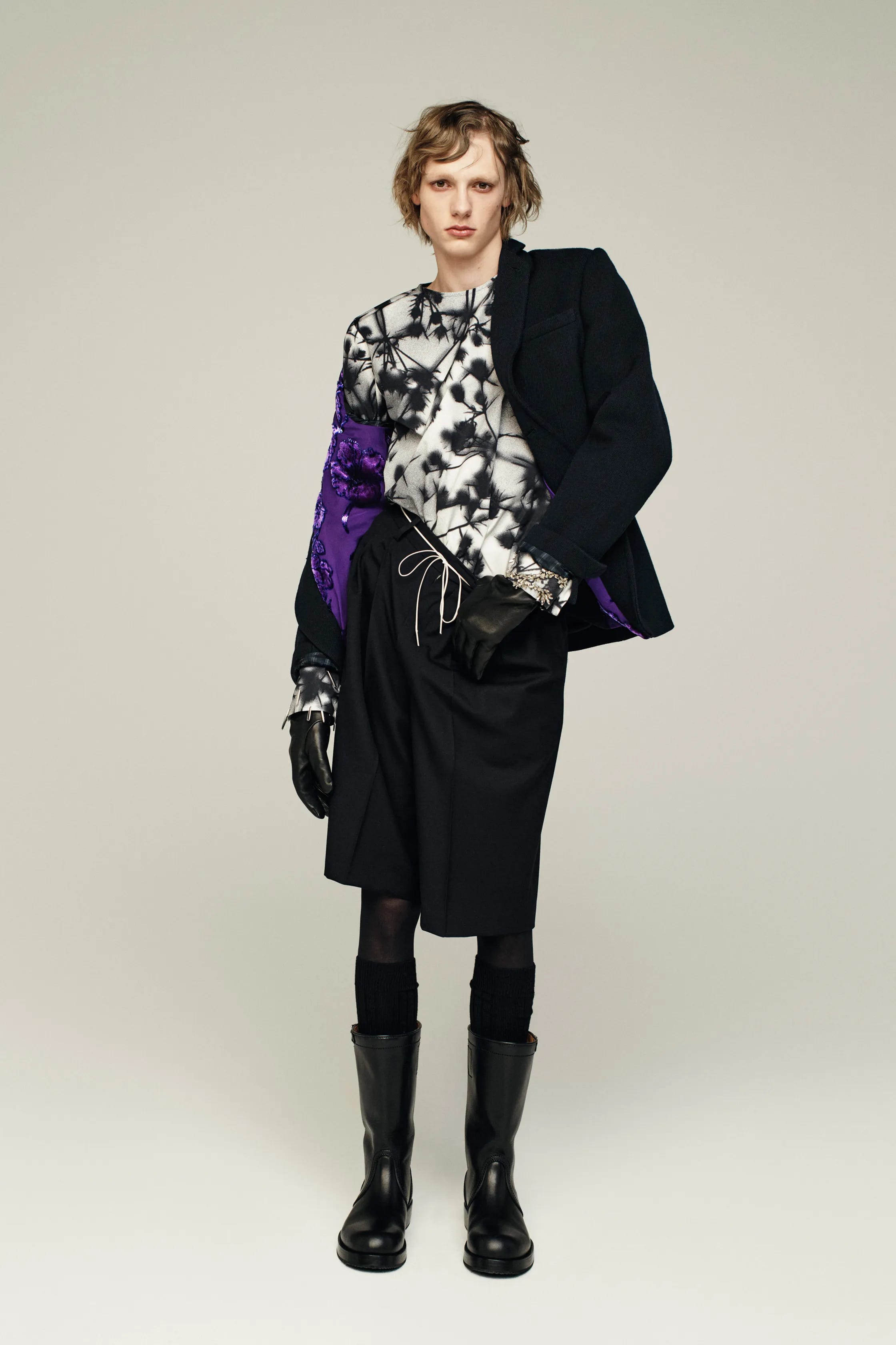
…but this men’s FW25 look successfully returns to more-realistic florals, this time in grayscale silhouette, almost like one of those cyanotypes we all made as kids but in black and white.
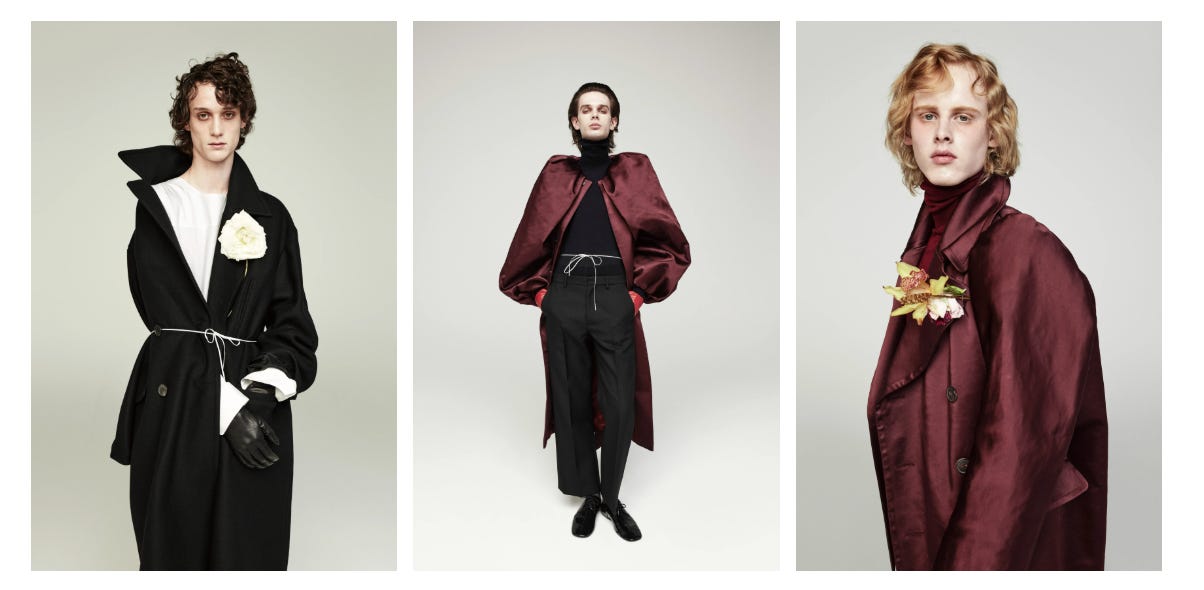
The collection doesn’t have a ton of floral patterns, but most of the beleaguered-looking models have a bloom or two tucked into their hands or lapels. Not really the kind of florals I’m envisioning for winter because the single blossom feels more like a desperate bid for some semblance of romance than like a matter-of-fact, medicinal application of floral imagery.
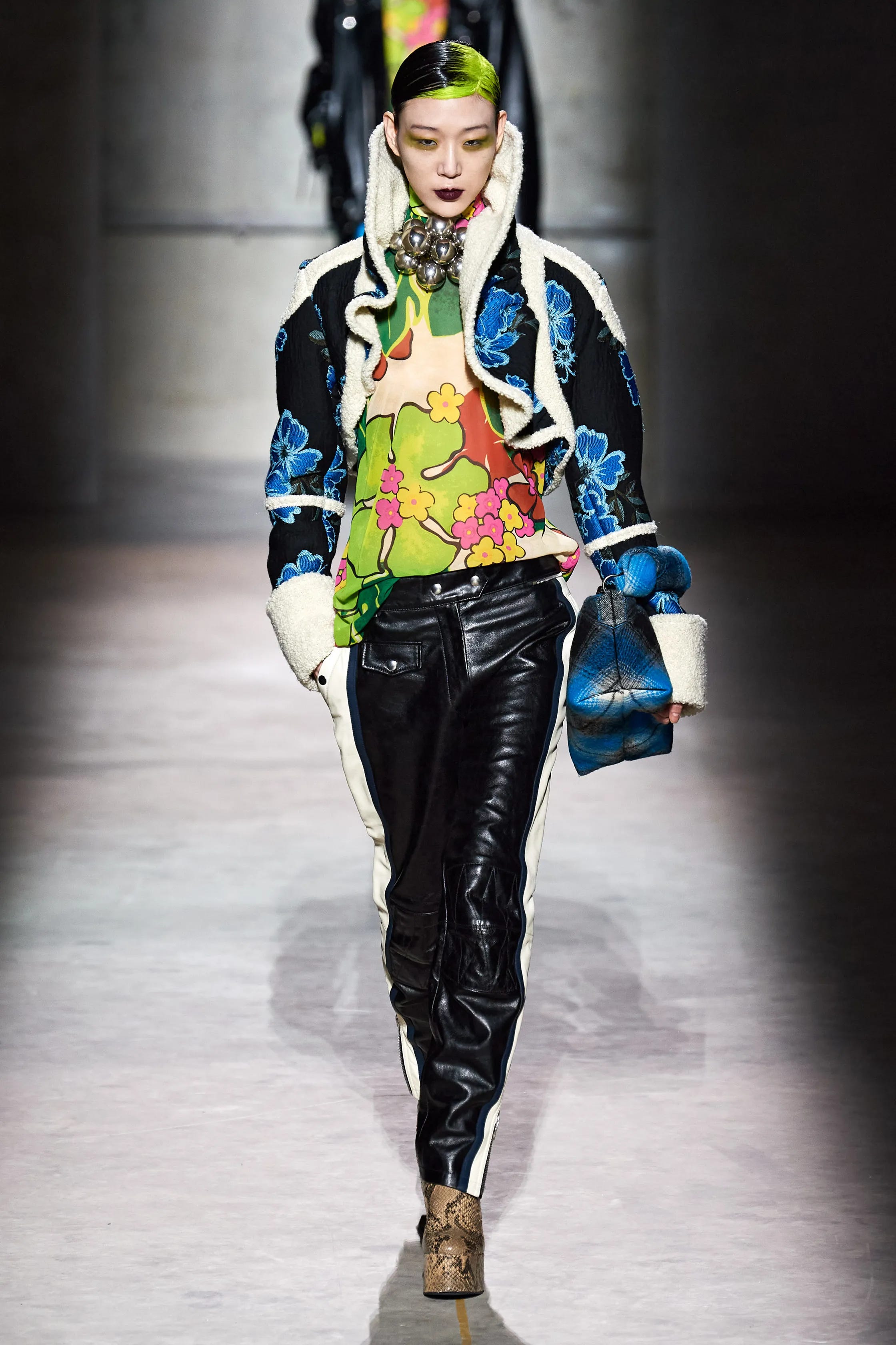
For FW20 RTW “womens’”, however, DVN succeeded where I was unimpressed in the “mens” department re: cartoonish florals. I think this is because the shocks of neon pink and green, plus the leather and shearling, contextualize these florals in a kind of cheeky “punk” mood. I do think the weird neck balls were unnecessary, but let me know if you think they add to this. ONE OF THESE DAYS I’m gonna do the damn feather trick on my hair part (probably to no avail, since it’s really not meant for curls). There’s a more-practical jacket available in the above blue floral print:
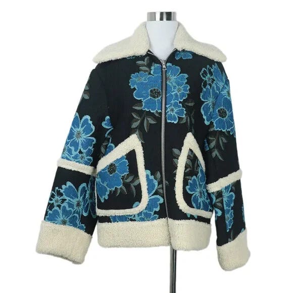
I think blue florals are perfect for winter because I don’t think any grow in this nearly-teal shade—I know of more pastel or, obviously, cornflower blue flowers in nature but I don’t believe there are any super-saturated blue flowers except the ones that have been dyed at a bodega or something, which emphasizes the “unnatural” drama of a punk look, as do the feather parts and violent eyeshadow.
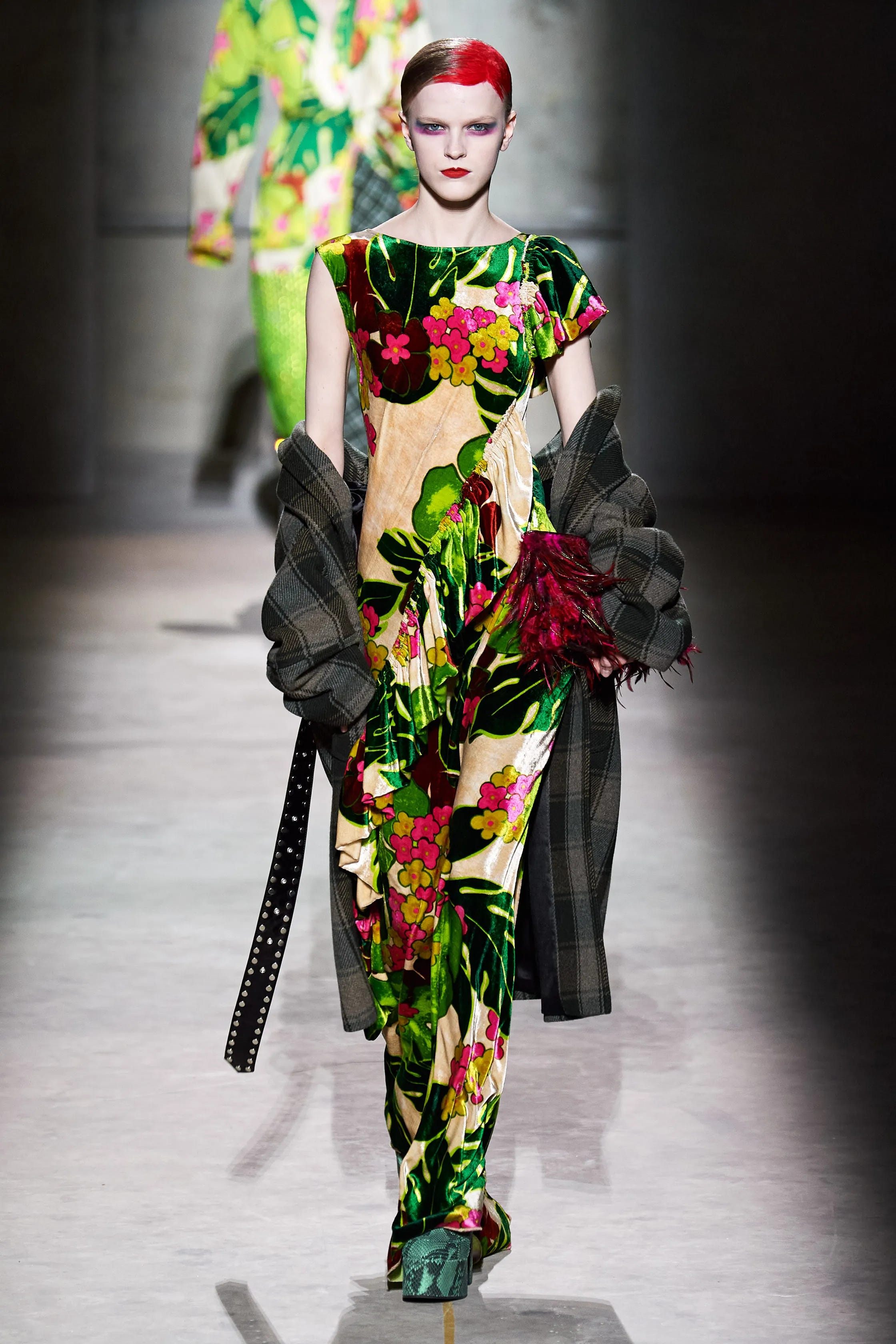
Such Fabulous Stains makeup! The slung-on flannel makes me think of a bratty teen who has been forced to wear matching tropical florals with their family for vacation pics but insists on keeping their ratty plaid shacket around their arms like a safety blanket.
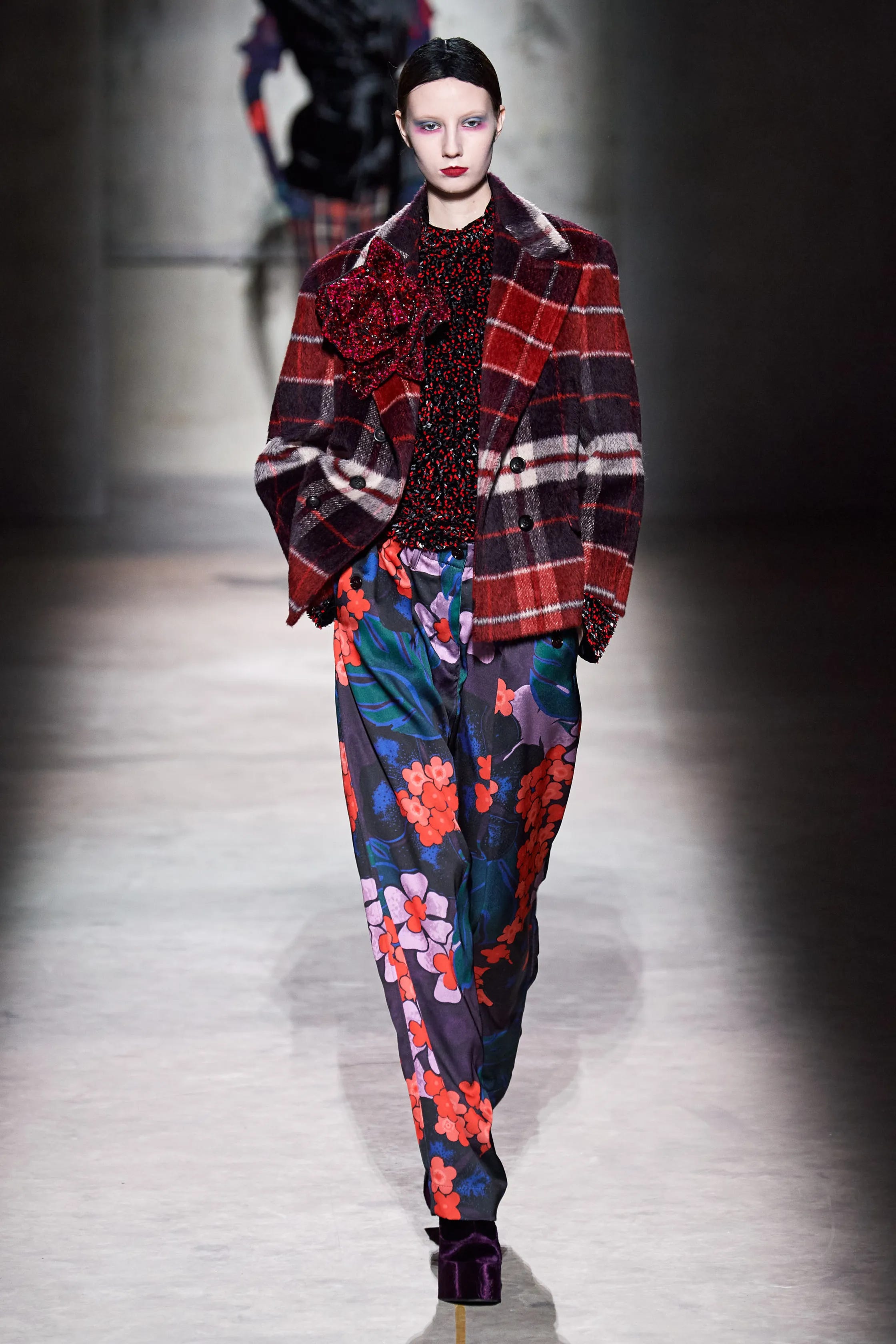
The plaid almost neutralizes the freshness and warmth of the flowers, like bringing a tropical bouquet into a log cabin.
